Forget This 100% Clickbait Chart!
Stocks did outperform gold, but that's not the message to remember.
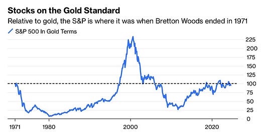
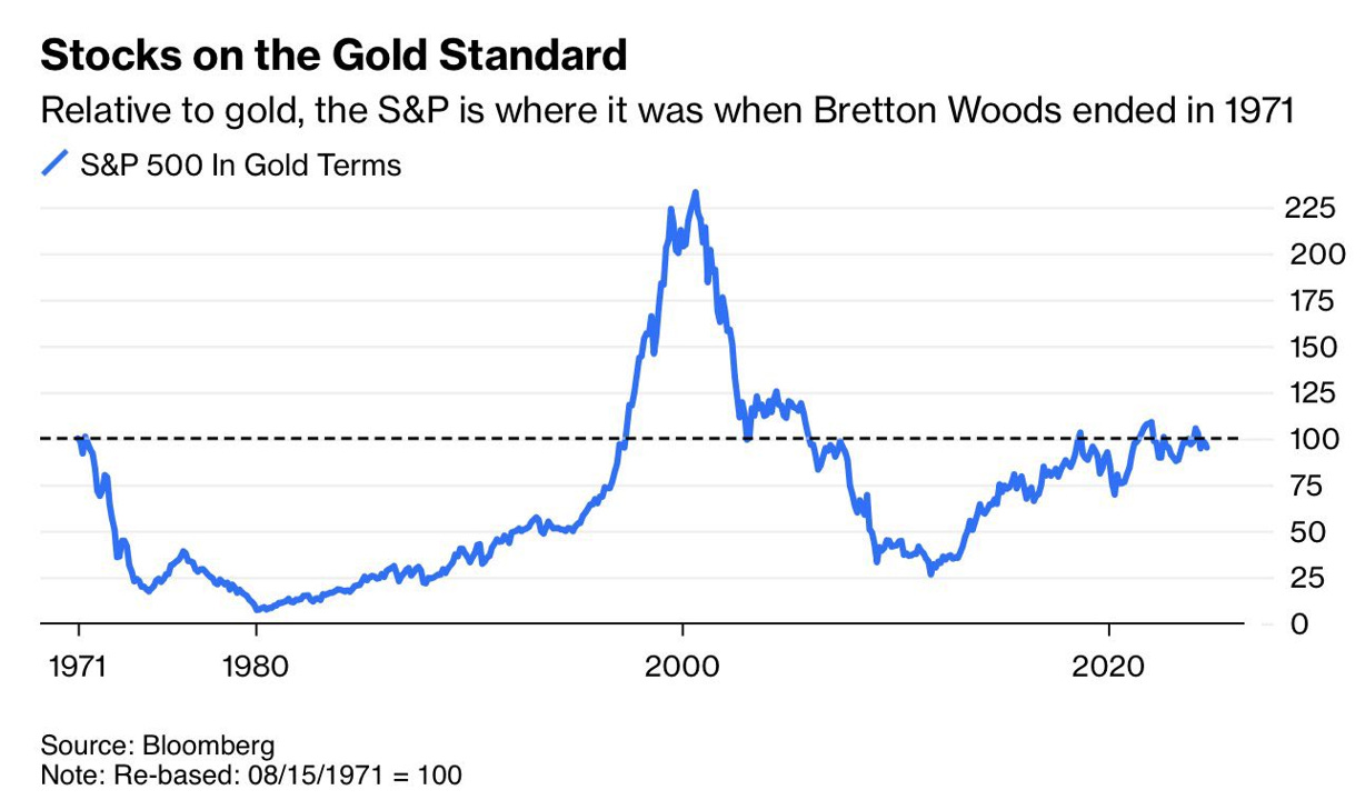
This post is a direct response to a Bloomberg chart, shown below, which is currently making headlines across many social media timelines and must be classified as 100% clickbait. "Since 1971, U.S. stocks have not outperformed gold."
Dividends?
The chart shows the performance of the S&P 500 Index expressed in gold, rather than in U.S. dollars, as is usually done. With a 25% allocation to gold in the Blokland Smart Multi-Asset Fund portfolio and the price at a record high, I am obviously pleased with gold's performance. However, this chart requires some "clarification" as it concerns the S&P 500 Index price index. One of the most important determinants of returns, dividends, has been conveniently omitted. That's not how it works! Therefore, below is a repetition of the Bloomberg chart, but now supplemented with the total stock market return, including the dividends paid by U.S. companies.
Excellent Investments
For the record, I'm using MSCI data here, but that doesn't change the results. In fact, where the Bloomberg chart suggests that U.S. stocks have only barely kept up with gold, according to MSCI, they've lagged by more than 25%. But the key here is that when you do include dividends, as you should, the U.S. stock market did outperform gold. Expressed in the value of gold, the MSCI USA Total Return Index has risen by 112% since 1971.
However, the chart doesn't do justice to the conclusion underlying the data. That 112% difference is totally "peanuts" when you consider that U.S. stocks have risen by more than 14,000% over the past 53 years (nearly 10% per year). Gold, with just over 8% per year, performs only marginally less.
Conclusion: Both stocks and gold have been excellent investments, and I expect, given everything happening in the world regarding debt, inflation, interest rates, and central banks, that this will remain the case.
Be Mindful of Central Banks
In this context, I would like to make another point. In the next chart, I've depicted the total returns of U.S. and Japanese stocks, once again expressed in gold.
To me, this is a real "wow" chart, a true eye-opener. Japanese stocks, once the darling of equity investors, have managed, albeit barely, to stay ahead of gold since 1971. But over the past twenty years, they have lost tremendous value relative to gold and at a rapid pace. And for those familiar with the decline of Japanese stocks in the early '90s, when it became clear that Japanese companies wouldn't conquer the entire world, that is not(!) the cause. The chart clearly shows this: Japanese stocks made a "high" against gold in 2000, ten years after the price implosion of the early '90s. From that point, however, it all went downhill.
Worthless Yen
Where does this massive underperformance come from? Partly from the bursting of that other 'bubble' in the early 2000s, but in recent years, it's mainly due to an extreme depreciation of the Japanese yen. In an effort to avoid facing the consequences of an aging population and declining potential GDP growth, Japan has borrowed itself into oblivion. As a result, the Bank of Japan has had to resort to increasingly extreme measures to control that mountain of debt. It's no coincidence that the Japanese central bank has kept interest rates near zero for years, owns almost half of all outstanding Japanese government bonds, and has reinvented "yield curve control."
Takeaway
The trend of gold rapidly appreciating relative to other investments is not unique to Japan. In Europe, we're heading in the same direction. Fortunately, with stocks, you still have dividends that provide a nice return. I don't expect the model where you, as an equity provider, get to share in the company's profits to disappear. But I am concerned about bonds. Unsurprisingly, the returns on this outdated asset class lag far behind those of gold. Something to ponder the next time you sit down (virtually) with your advisor, asset manager, or private banker.


